How to Add Trendlines to a Chart in Excel 2013
Trendlines are a great way to analyze data contained in a chart. If you learn how to add trendlines to a chart in Excel 2013, you will not have to worry about having to read complicated charts or extensive raw data. You can get a gist of the data contained in your workbook by a simple glance at your trendline as well as use your data to predict trends. This tutorial will show you how to add trendlines to a chart in Excel 2013.
Step 1: Launch Excel 2013
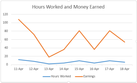
Step 2: Open a workbook that contains any kind of chart
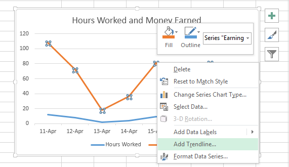
Step 3: Right-click on the data series and select Add Trendline…
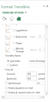
Step 4: In the Format Trendline pane that opens up on the right side of the document, you must first choose a trend/regression type. In this case, you should select Linear
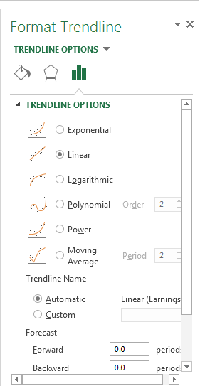
Step 5: You also need to select the number of periods you want to include in your trend. If you want to see trends before your data period began, enter the number of periods you wish to include in the Backward textbox under the Forecast section. If you wish to see future trends, enter the number of periods in the Forward textbox
Step 6: Click on Display R-squared value if you want to know just how well your trendline fits the actual data that was used to make your chart. The closer this number is to 1, the closer your trendline is to the chart upon which it was made.
