How to Create a Chart in Excel 2013. Charts are a great way to sort out data that you have stored in an Excel 2013 workbook. They help you visualize your data and make it easier for you to analyze any trends that may exist. Excel 2013 allows you to modify and format your chart based on your needs. The tutorial below will teach you how to create a chart in Excel 2013.
Step 1: Launch Excel 2013
Step 2: Enter the data you want to make a chart for
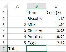
Step 3: Highlight all the data that you want to include in your chart. Make sure you do not highlight the column or row headings
Step 4: Click on the Insert tab and look at the Charts section
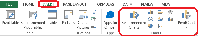
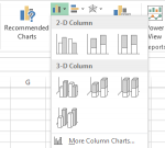
Step 5: Choose what type of chart you want. Excel 2013 lets you choose from a number of different charts including Column Chart, Pie Chart, Bar Chart, Area Chart, Scatter Chart, Bubble Chart, Stock Chart, Surface Chart, Radar Chart, Combo Chart and Pivot Chart. You can move your mouse over each type of chart to find out when they are best used in order to help you determine which chart you should use. If you still can’t choose your charge, you can click on Recommended Charts and Excel 2013 will choose for you.
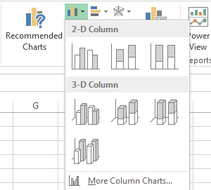
Step 6: If you decide to create a Column Chart, click on Column Chart in the Charts section of the Insert tab. Click on the type of chart you want. Excel 2013 will produce it
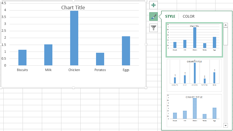
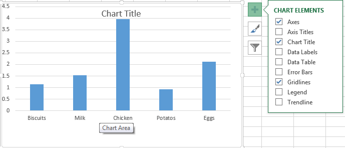
Step 7: You can add more Elements to your chart by clicking on Chart Elements next to your chart
Step 8: You can change the color and style of your chart by clicking on Chart Styles next to your chart